website is to show the product and service, the key way to attract customers. But many website high traffic , order rate but low , one reason for this is CTA , the Call to Action , the Action guide) design is not reasonable.
today, we have to resolve how to through the optimization design of CTA for everyone, improve website conversion rate.
what is CTA ?
CTA, action leading, is an important tool in marketing. It is usually characterized by a button , a slogan or a logo , used to guide the user to a particular behavior, such as purchase, register, attention, etc.
why optimization CTA can improve the conversion rate?
1. Enhances the user attention
Optimized CTAdesign is more able to attract the attention of users, so that users in the first time to understand your core business or product.
2. desire to enhance the user action
a good CTA design should be able to stimulate the user's action, make them more willing to click, order, or to participate in.
3. to improve the user experience
CTA of clear and concise design allows users to more easily understand your intentions, to improve the user experience.
4. Enhance brand awareness
unique CTA design can increase user impression of the brand, increase brand awareness.
how to optimize the design of the CTA?
1. Clear goals
CTA the first step in the design, is to clear the user's actions. What does the user want? Is the purchase product? Is it for more information? Or contact you? An effective CTAcan only be designed if the user's goals are clearly defined.
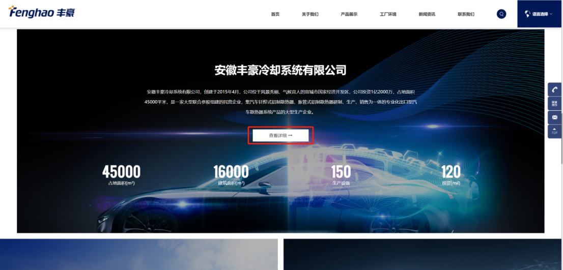
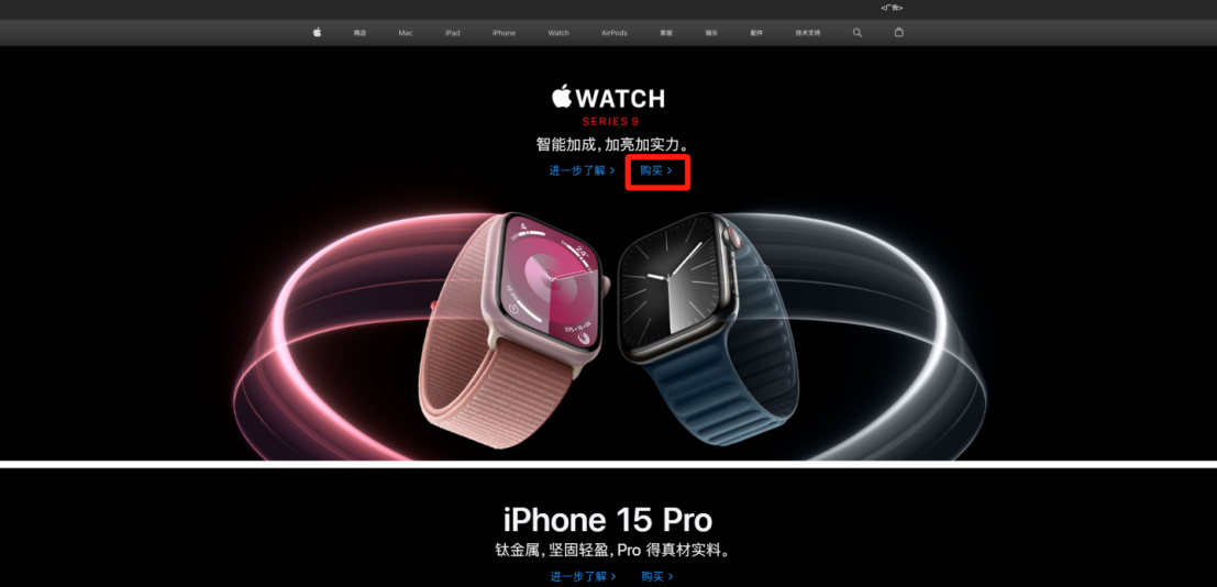
for chestnut
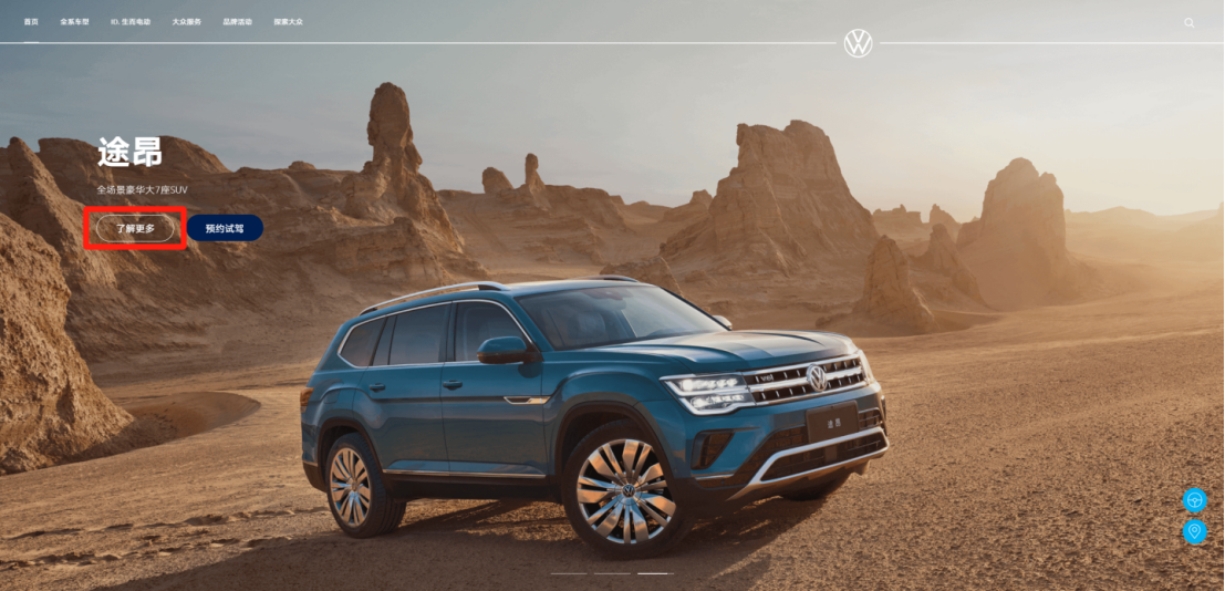
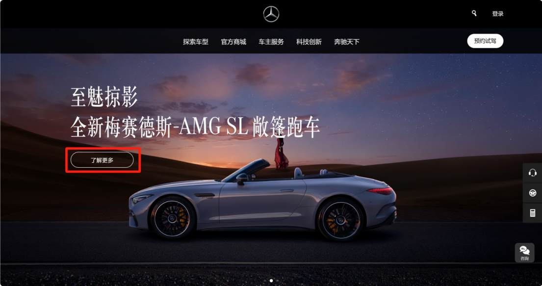
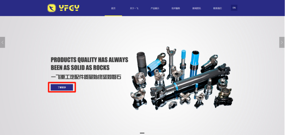
if the user wants to buy a product, CTA can be a "buy now", if the user wants to know more information, CTAcan be "Learn more".
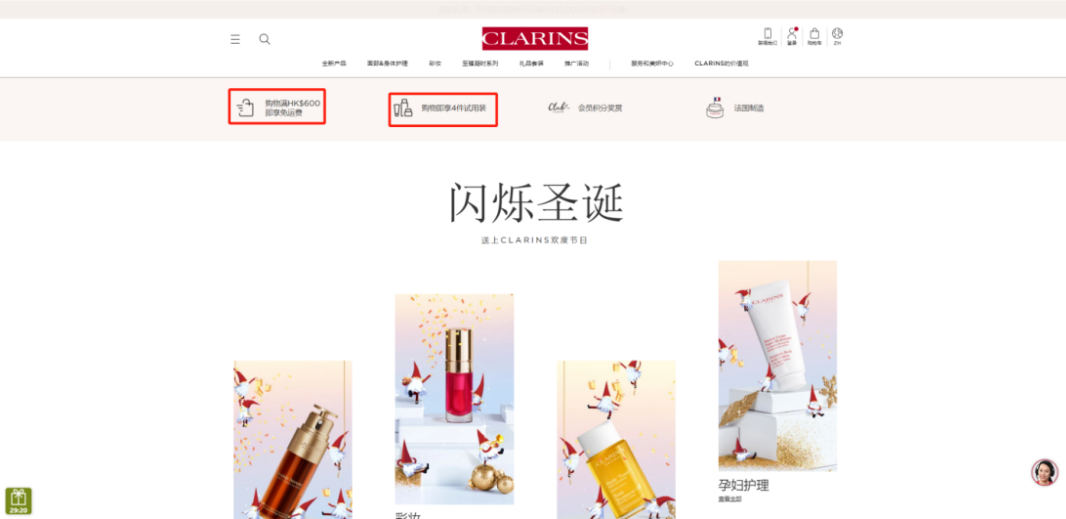
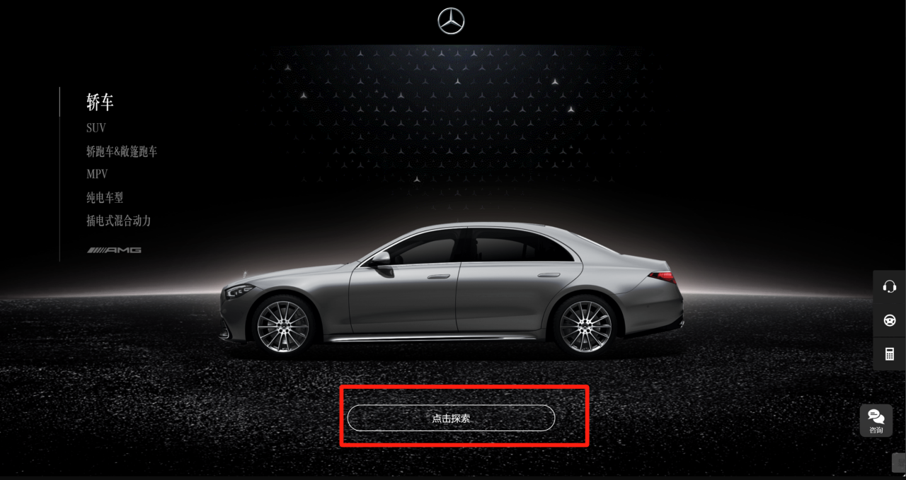
2. Short and concise
CTAtext should be concise and clear at a glance. The user browsing the website, often will only stay for a few seconds, so CTA characters to to streamline , so that users can one understand it.
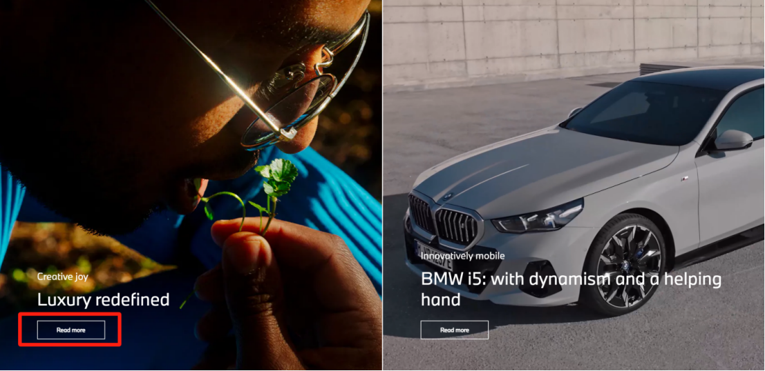
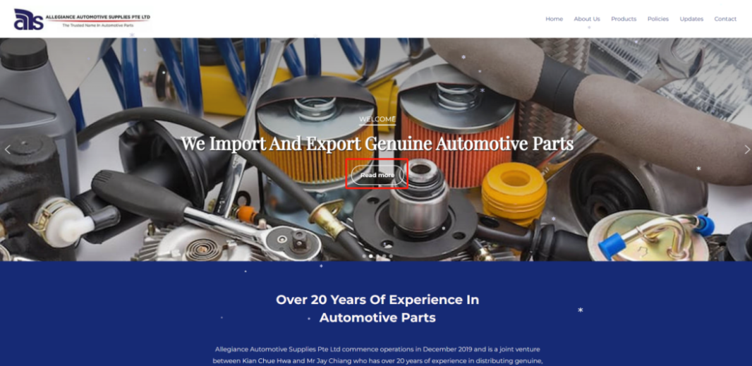
for chestnut
"Buy Now ", "Read more ", such as short and concise.
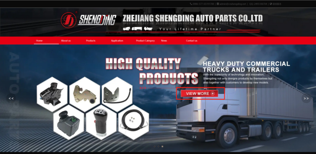
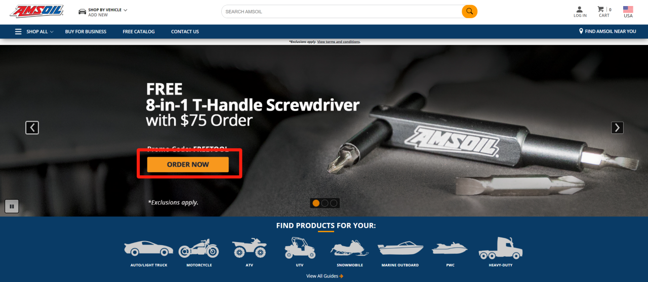
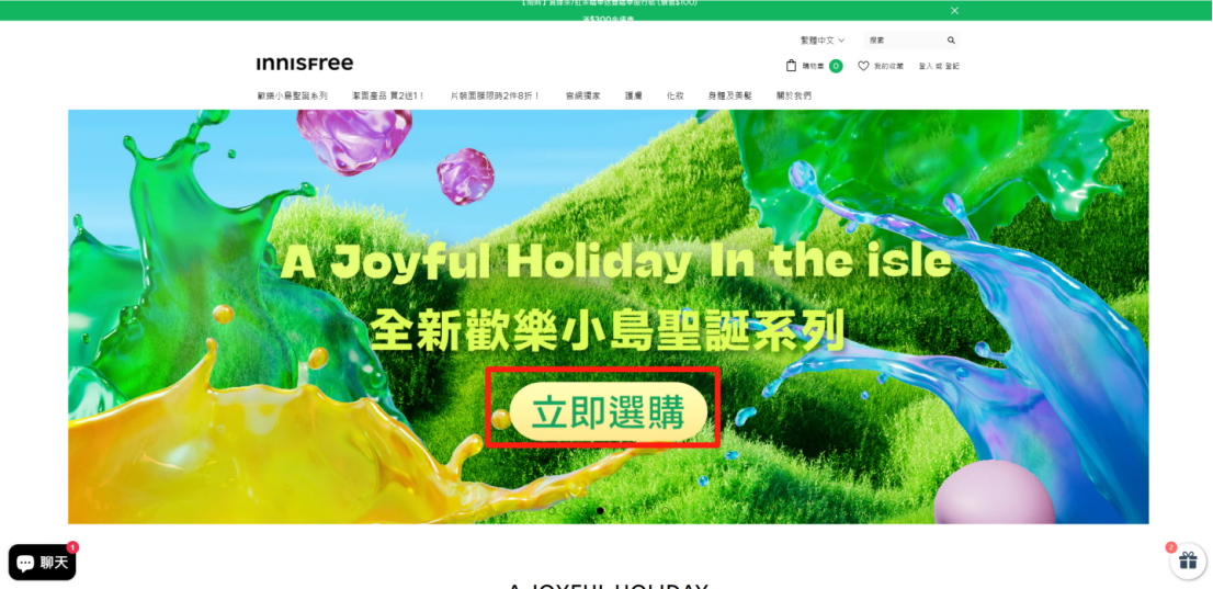
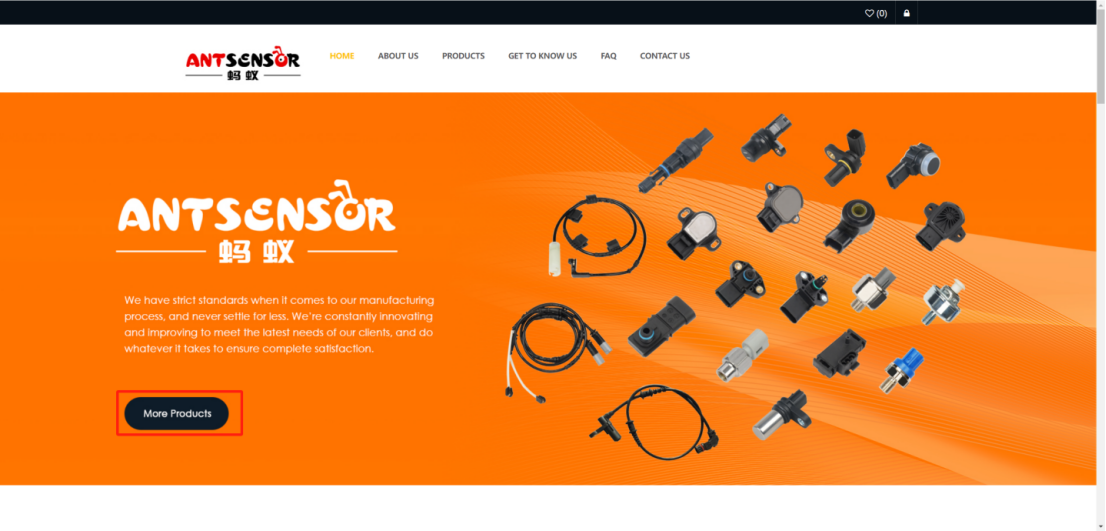
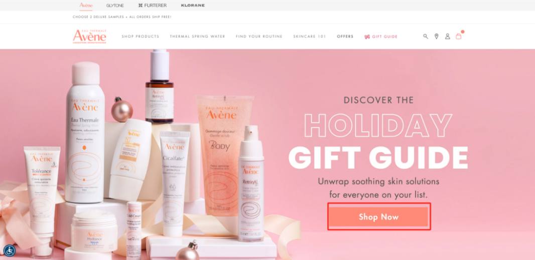
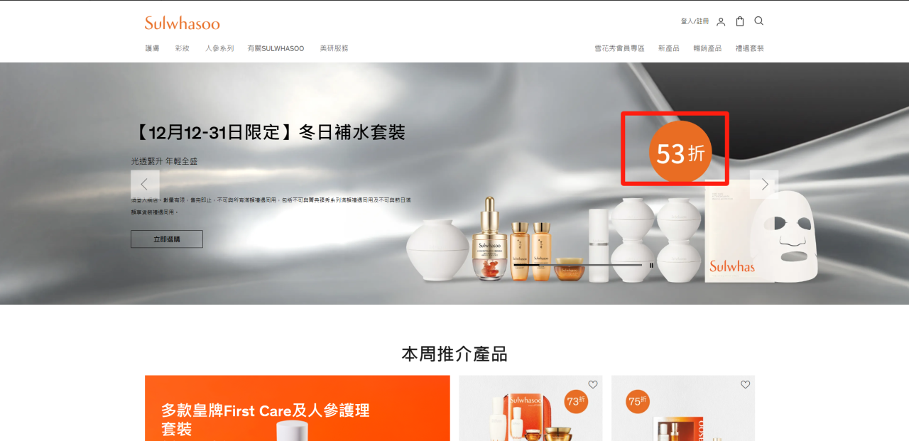
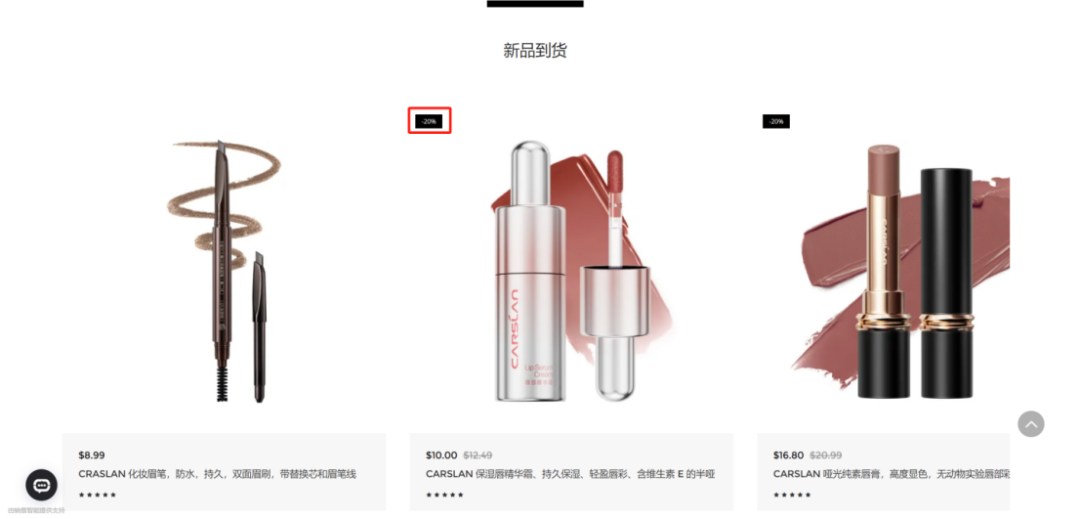
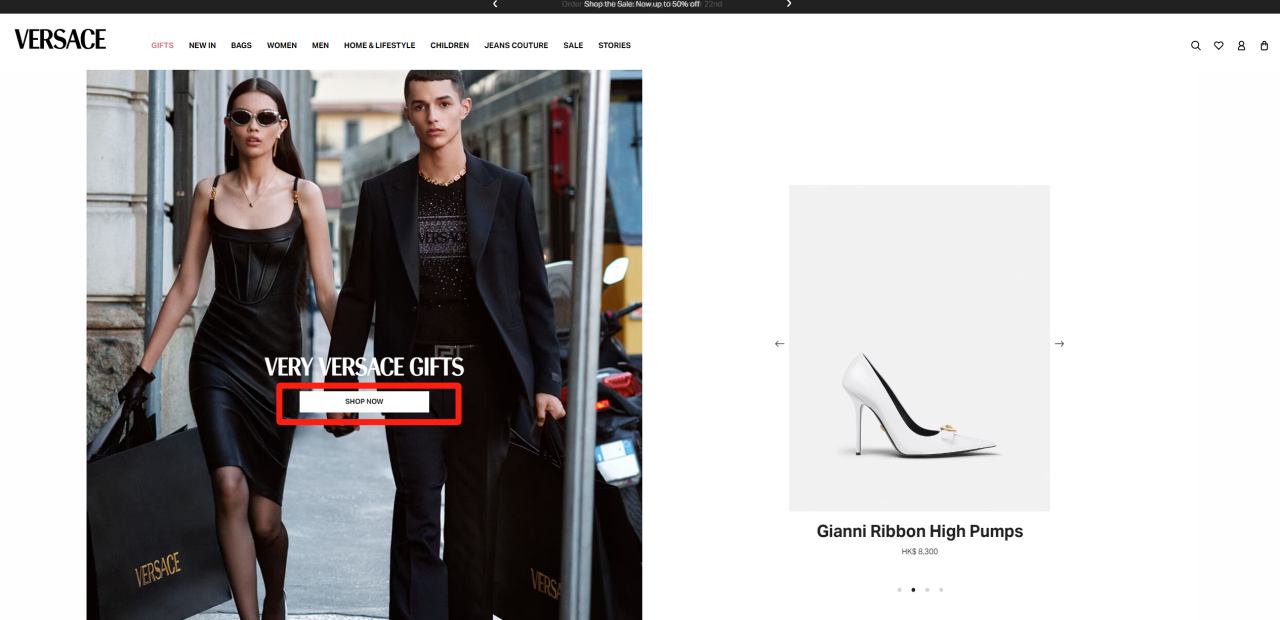
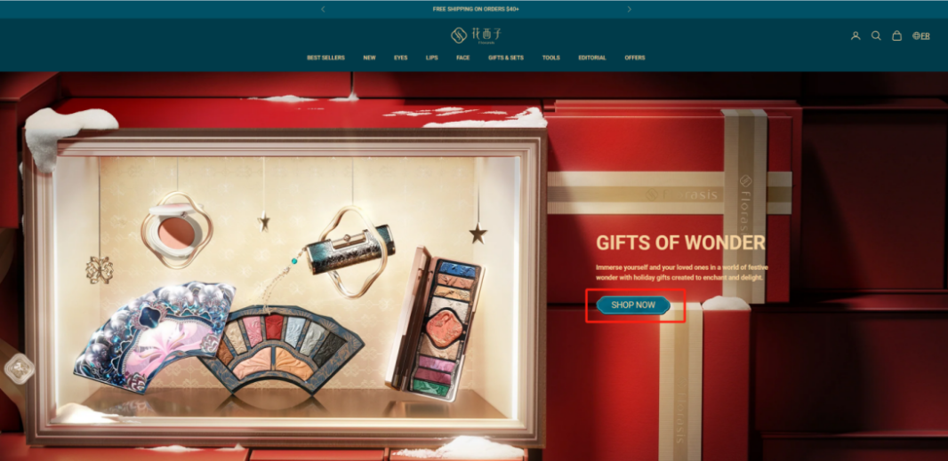
3. Strikingly prominent
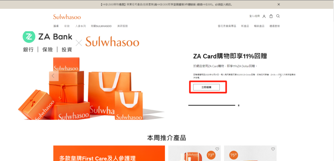
CTA button to eye-catching, so that users can find one. Can use bright-coloured color , eye-catching position or characters to the CTA button.
for chestnut
CTA can be button set to bright colors and conspicuous position on the page, For example, home page banner, top of the page, bottom of the page, or side of the page.
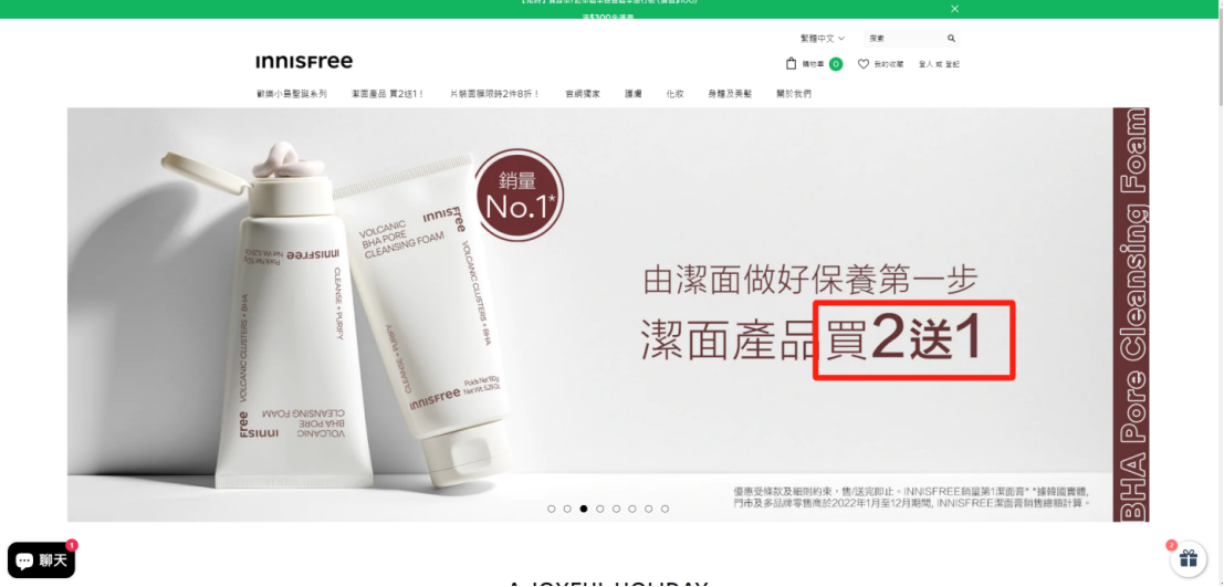
4. Meet users expect
CTA should meet the expectations of users. What do users come to your site for? ? Is the problem solved? Is it getting information? Is it to meet demand? Only by meeting user expectations can CTA effectively guide users to take action.
for chestnut
if users are looking for is favorable, CTA can be a "special group" "buy two, get one", etc.
5. A call to action
CTA to explicitly tell the user you want them to what action .
for chestnut
if want users to buy the product, the CTA can be "buy now".
conclusion
CTA design is an important link of website marketing.
Enterprises should pay attention to CTA design, improve the conversion rate of users through reasonable design, and achieve marketing goals.