on the Internet, the official website is the key to the brand image, a direct impact on users of brand first impression . Some brands website well-designed , leave a high-end atmosphere .
is this why ?
What is the secret of their website?
Can we do the same?
1. Domain name
First, let's look at domain names. A good domain name is the foundation of the website, it needs to concise , easy , and is associated with the brand.
for chestnut
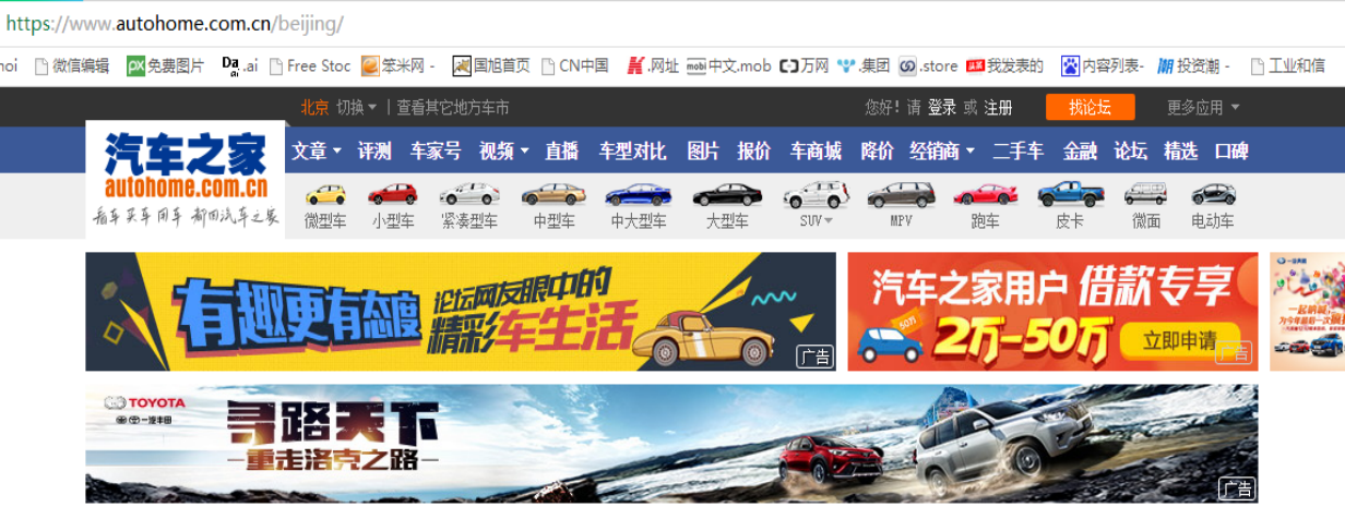
"autohome.com.cn", Although it is simple and easy to remember, it has limited relevance to the brand.
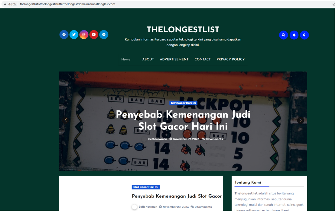
“thelongestlistloftthel ongeststuffa
tthelongestdomainnameatlonglas
.com "is insecure and too verbose to be easily memorized by users.
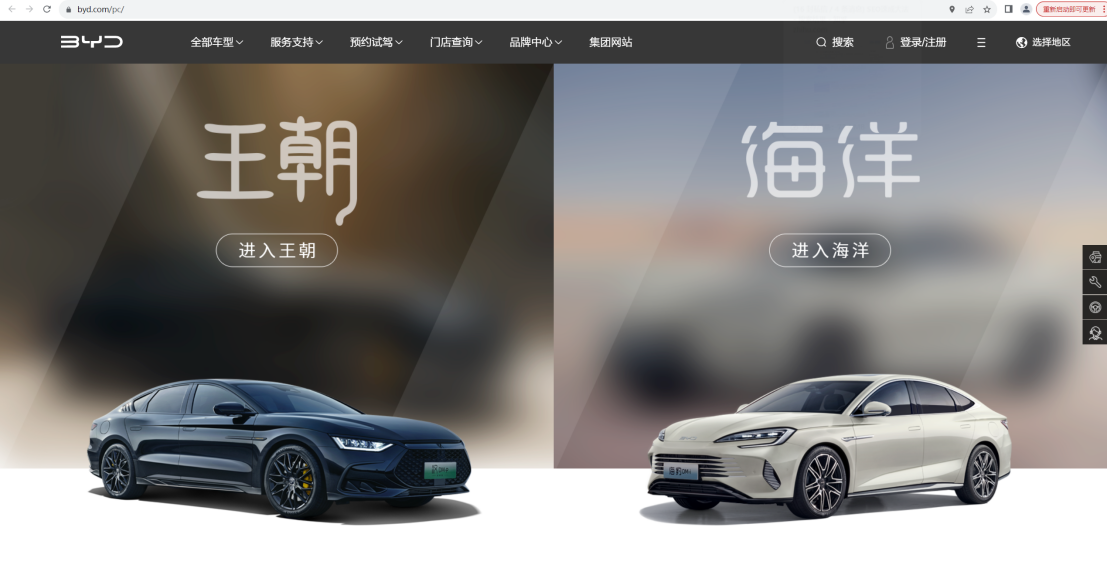
by contrast, website domain name "byd.com" "huawei.com", concise and easy, and highly correlated with the brand.
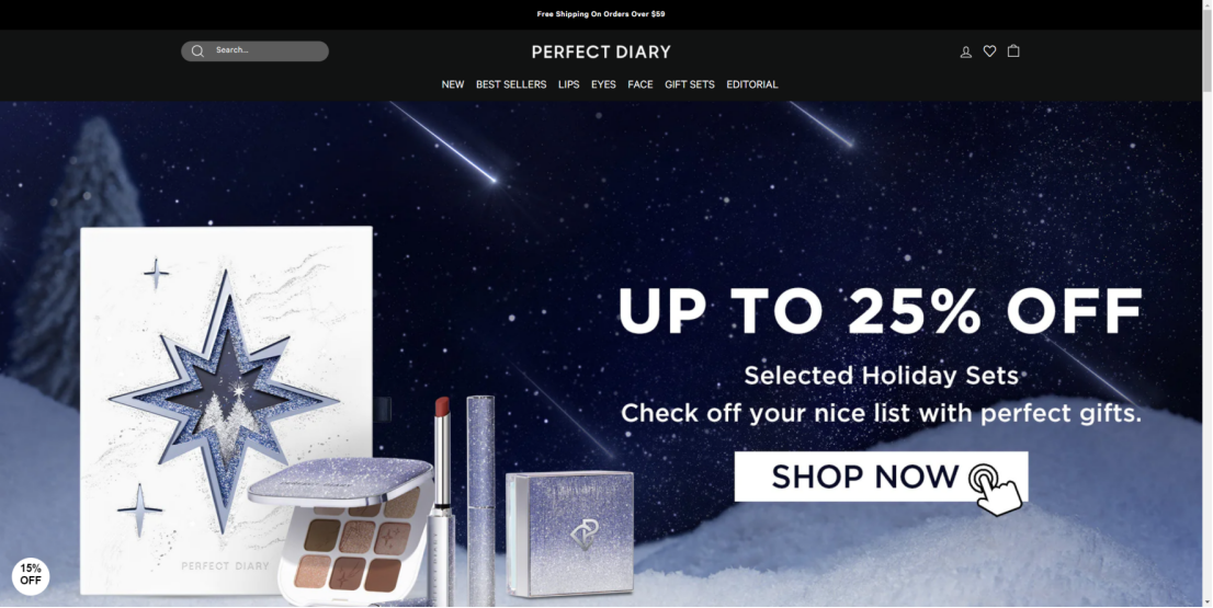
2.b anner
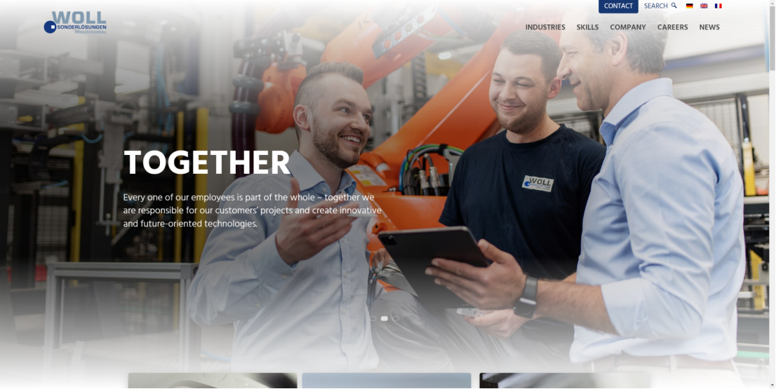
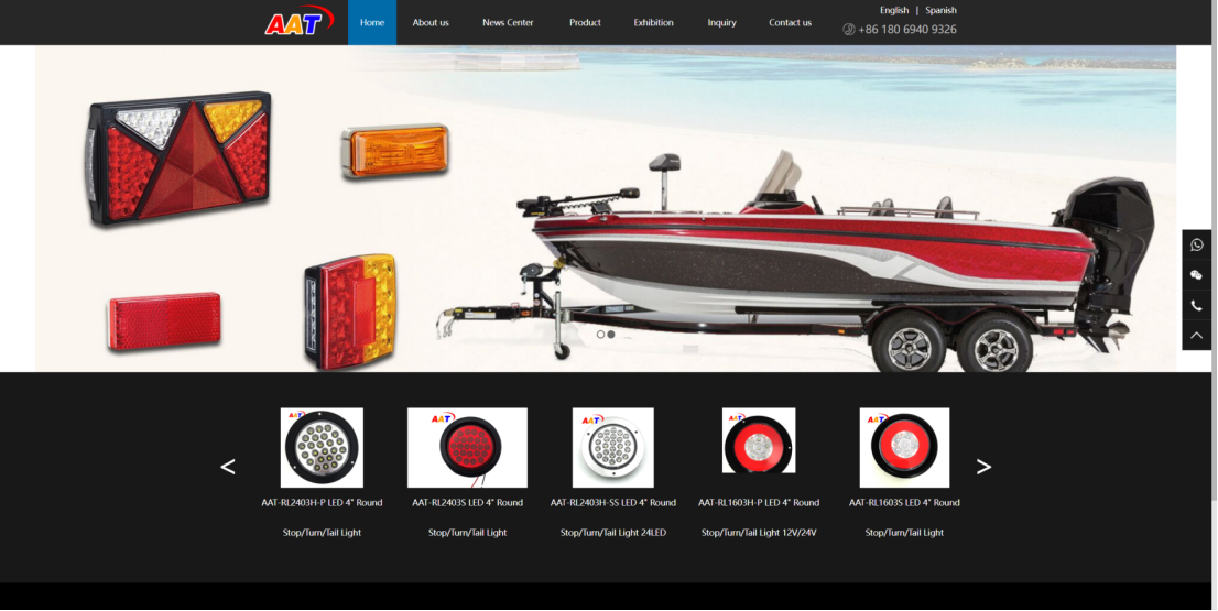
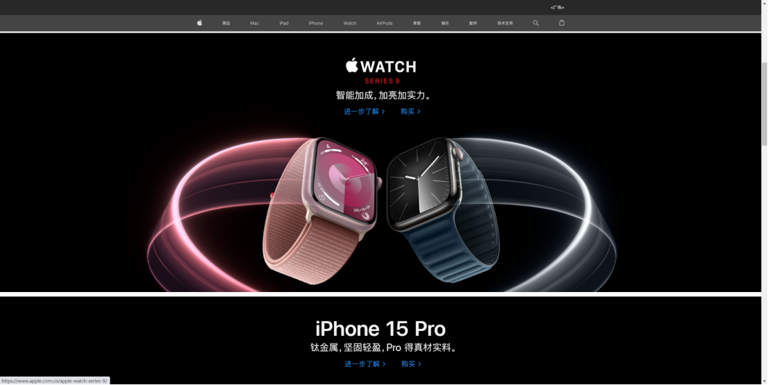
Second, Banner. Banner is a website '' of appearance of . It needs to beautiful , attractive . At the same time also to be able to accurate to convey the the information of the brand.
A chestnut
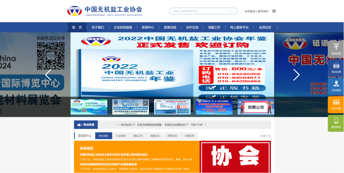
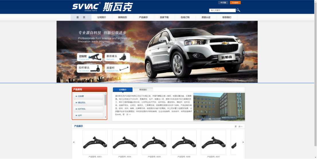
some website banner words crowded, not enough beauty.
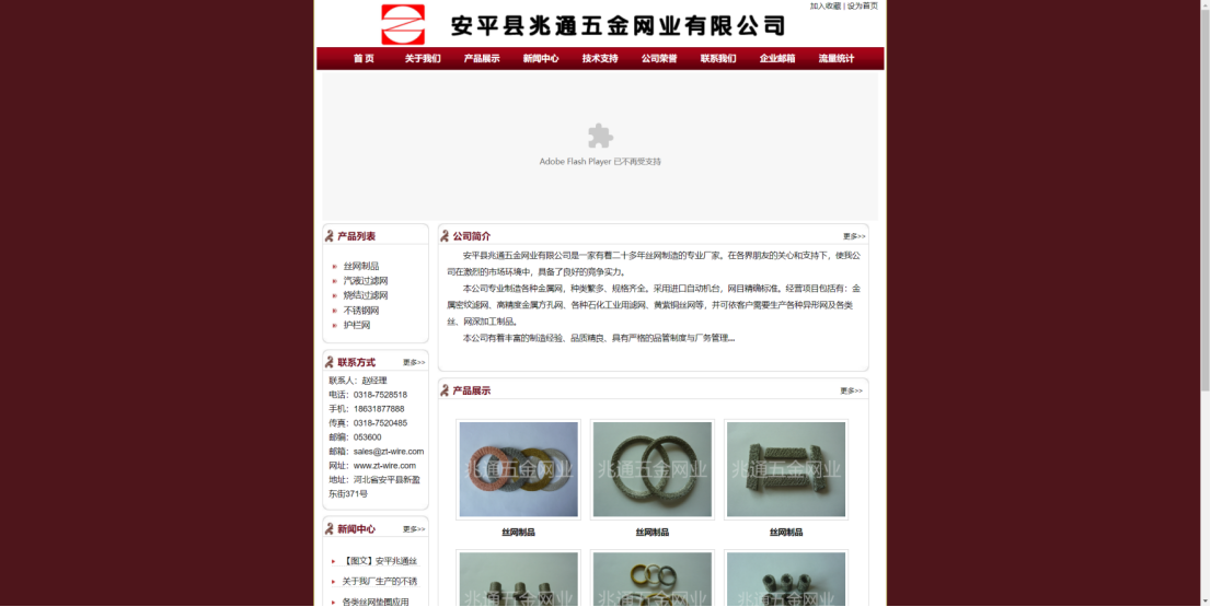
Some websites have blurred banner images.
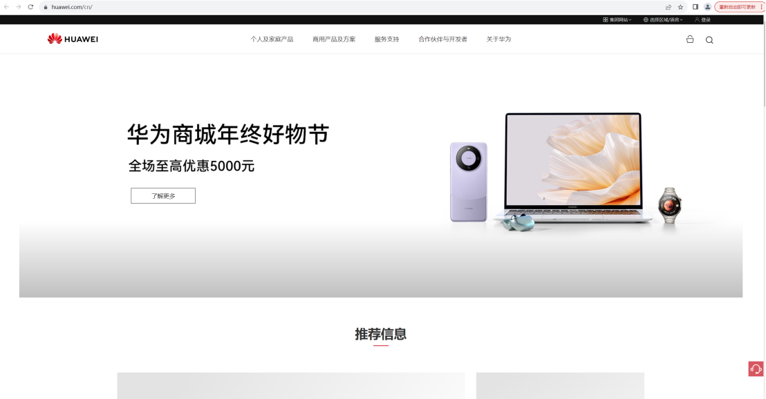
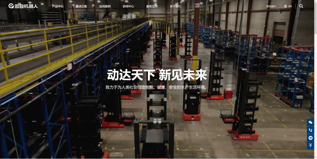
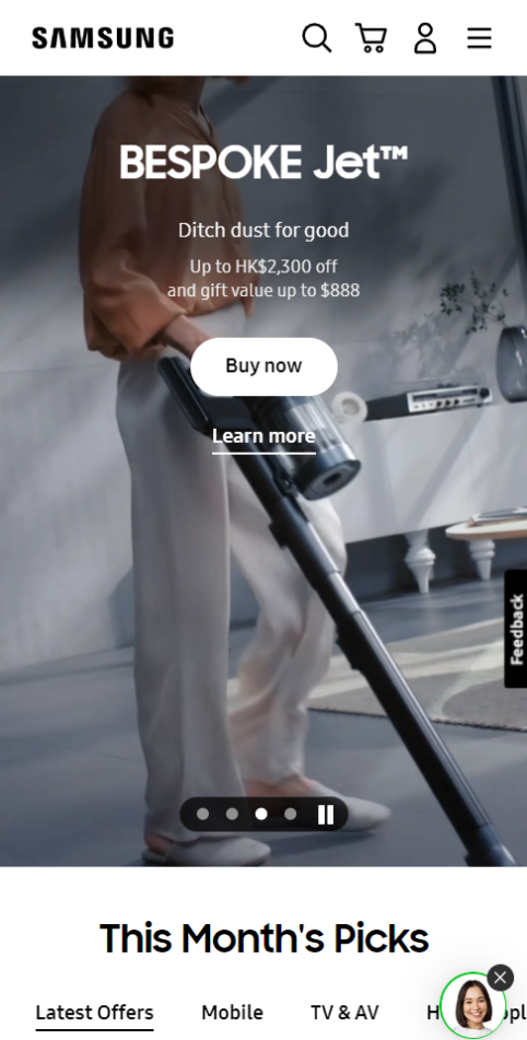
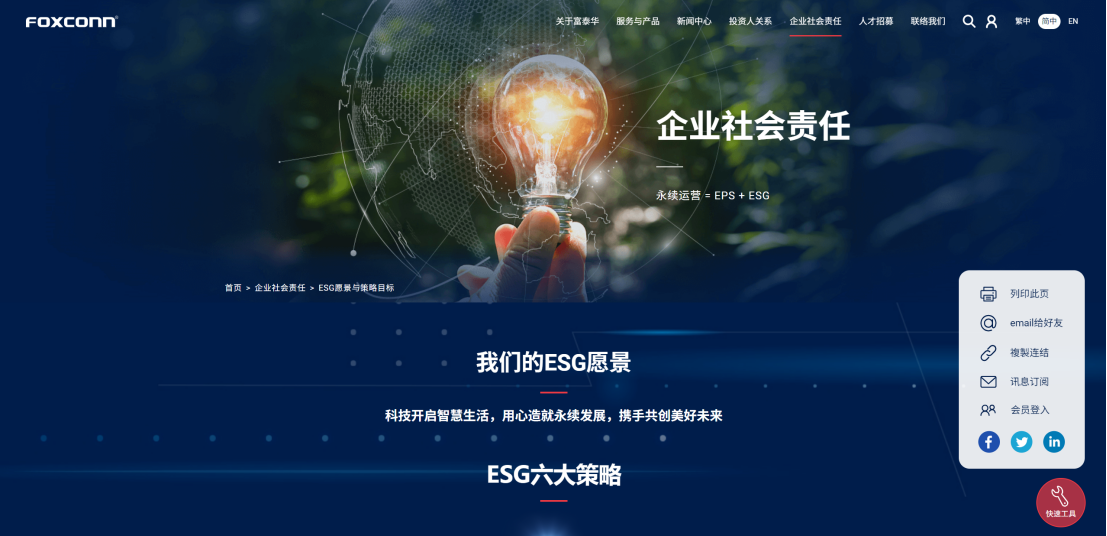
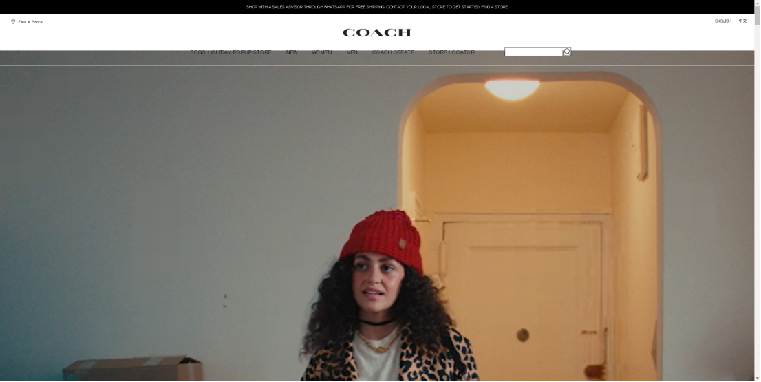
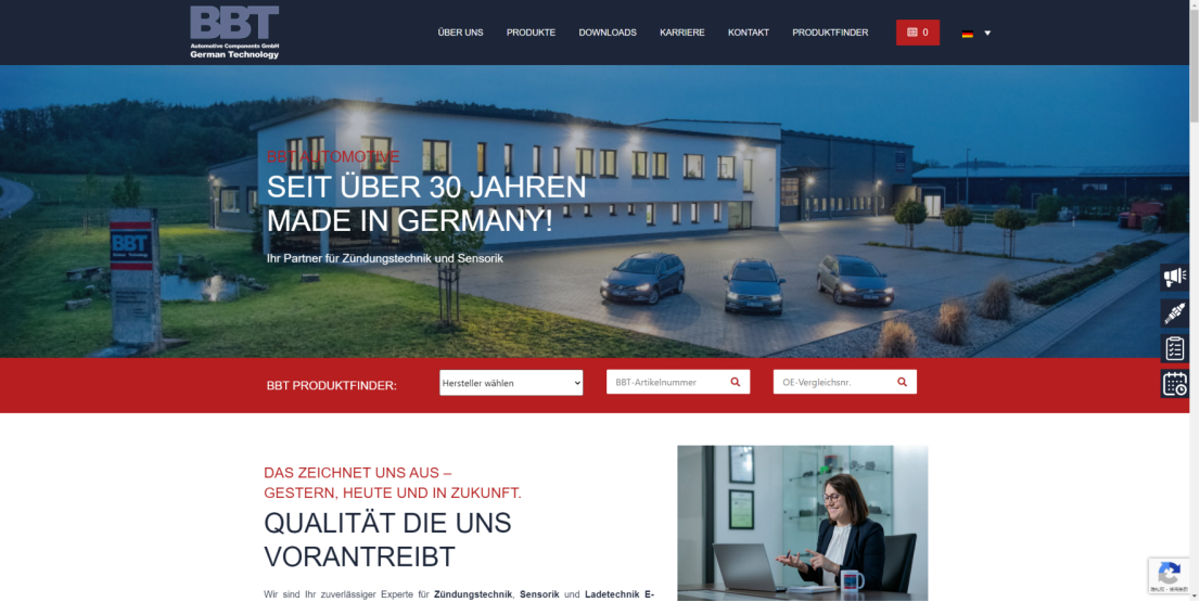
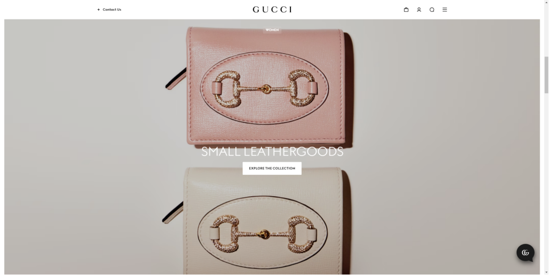
And these official websites are presented in the form of full-screen display and dynamic video, simple and atmospheric.
3. Mobile terminal
Then, mobile adaptation. With the popularity of smart phones, the adaptation of official websites on mobile terminals has become particularly critical.
A chestnut
figure shows some of the mobile terminal by the club's official website is not complete.
Some web text is not fully displayed on mobile.
while the website to ensure that the user no matter when and where can get excellent experience.
4. Contact entry
Then the contact entry. a website without obvious contact entry .
could confuse the user.
for chestnut
you won't find some website links entrance, may miss out on potential customers.
And these official websites, provide an obvious and easy contact entry, so that users can easily find contact information at any time.
5. The navigation bar
the navigation bar is a website ' the compass ' , need to clear . Let users easily find the information they need.
for chestnut
some website navigation too multifarious, some dislocation, affect the user experience.
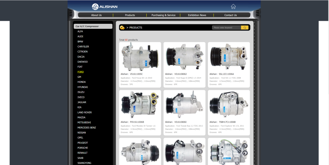
and these website, the design is concise, clear classification, Make it easy for users to get the information they need.
6. Action guide
Let's look at action guidance. Action guide is a website 'guide' , it needs to clear and specific , let the user know what I should do.
for chestnut
these website without action guidance, users in the use, may be confused.
Contrast these official websites, clear action guidance, users know what to do next.
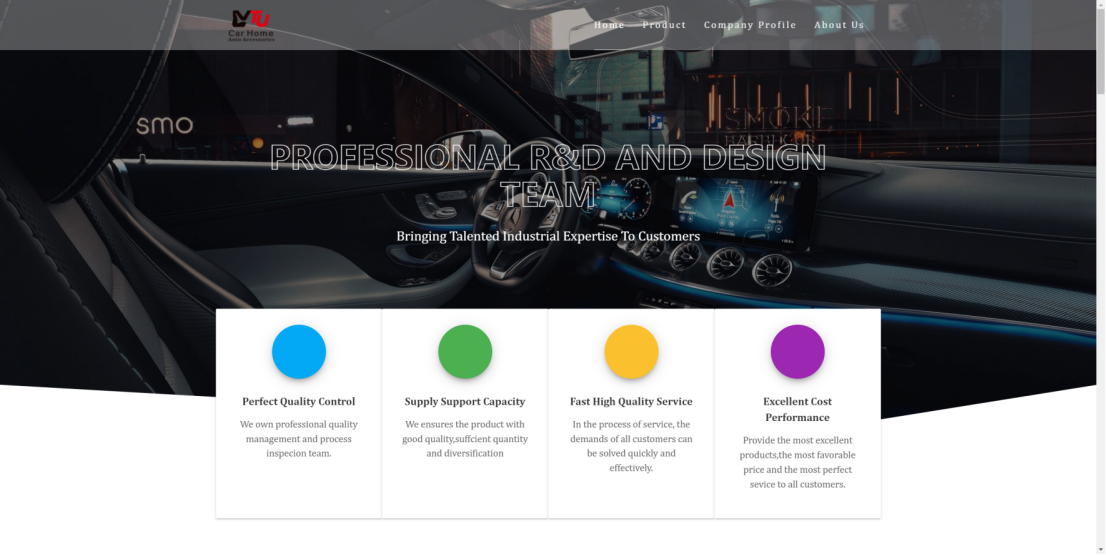
7. Content display
Finally, the content presentation. The main content should be clear, concise and easy to understand . Use appropriate fonts, colors, and layouts to highlight important information and ensure that everything appears correctly on each device.
for chestnut
some of these website content too much text When using, users may not have the desire to see it, and some are not beautiful layout.
these website using the appropriate font, color and layout to highlight important information.
to summarize
on the whole, 'tall on the mystery of the club's official website, not can't solve.
As long as we can learn their design concept, pay attention to the quality of content, the pursuit of advanced technology, we can also do "tall".
Let's work together to make our official website can also leave a deep impression!